
Eagle-eyed drinkers may have noticed a few changes to some Wiper and True cans this year. These new details have each been carefully designed to improve accessibility and clarity, making it easy to pick out a beer you love. We hope you like our new look. In this journal piece, we'll tell you more about these changes, and the reasoning behind them.
TEN YEARS OF BLACK, WHITE AND GOLD
Our distinctive black, white and gold branding has been part of our identity since the very beginnings of Wiper and True, ten years ago when we were bottling into 500ml units by hand. Our initial design brief was to create a simple, luxurious feeling look that appealed to everyone, and avoided the traditional, typically ‘macho’ cliches of much beer branding at the time. We wanted to make clear that our beer was for everyone.
Created by the immensely talented Hamish Makgill, the result was our shimmering, golden illustrations, designed to pique interest from behind the bar or at the fridge, inviting the curious-minded in for a beer. Hamish has been an integral partner for over a decade now, and it’s impossible to imagine Wiper and True without his design work. Happily, the days of hand labelling and bottling are behind us, but our simple, pared-back look has remained a constant, and we, in turn, remain very attached to it, in spite of all the changes that the world of craft beer design has seen over the years.
CORE BEERS: SPOT THE DIFFERENCE
In recent times, though, after lots of interesting feedback from our brilliant, engaged community, we’ve been working with Hamish on a quiet evolution of our appearance. During our last customer survey, some of you told us you find it tricky to differentiate between our cans, and that spotting the difference between glinting golden illustrations in a hurry can be tough. At the bottleshop, choice paralysis can often loom as you stand before a monolithic wall of cans, so being able to quickly pick out key information like a beer’s style or strength is also increasingly important, and something we wanted to work on for our drinkers.
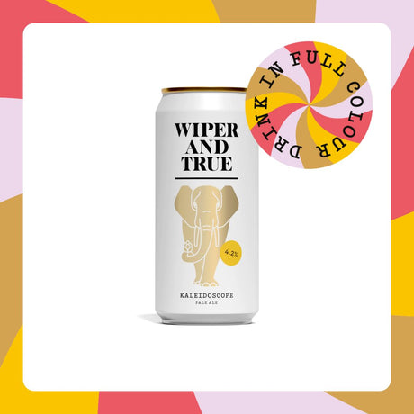
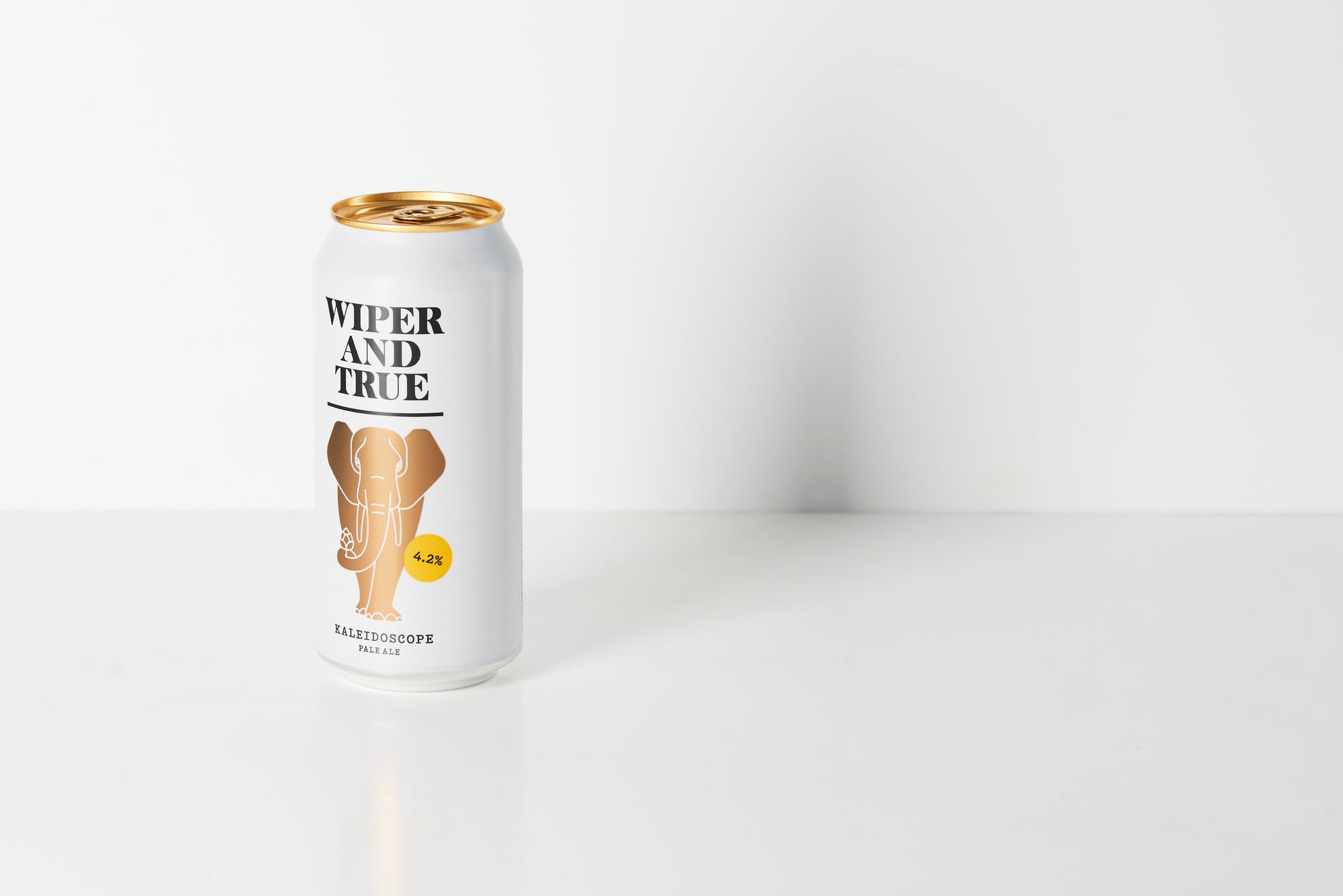
Thanks to your very kind feedback we know that lots of you are as fond of the elephant, rocket, boat and the rest of the golden gang as we are, and so we could never remove these cornerstones of our designs. Instead, we’ve opted for a simple colourful spot of colour to demarcate different beers, also using this spot to call out the beer’s ABV, loud and proud. Over the next few months as we roll our our new label designs, you’ll see each of our core range beers (six always-available beers across a selection of styles) now sporting a different coloured dot, making it easier to scan a shelf and zone in on your favourite, whether that’s a low strength table beer or a higher ABV IPA. We've also made small changes to our font, for increased legibility.
The first beer in our core range to sport this new get-up is Today, our stunning new lager. Find out more about that over on our journal.
For your enjoyment, here is the complete lineup of the six Wiper and True core beers in their new get-up:
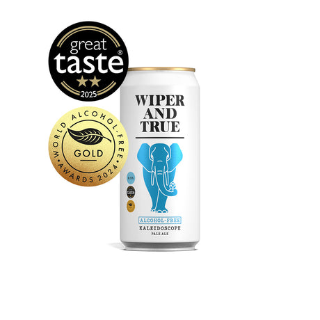
 Our alcohol-free beer, Tomorrow, is identifiable by its gleaming blue foiled design, and future alcohol-free releases will also be identifiable by the same blue tone.

LIMITED EDITION SEASONAL RELEASES: A NEW LOOK
A regular stream of exciting new beers is one of the things that makes the craft world so special. Week in, week out, there’s a new release and a whole, wide, world of styles and flavours to explore. At Wiper and True we absolutely love this facet of our industry; unique and recurring special releases are the ideal canvas for experimenting, creating and refining. But as a drinker, how do you keep track of this endlessly rotating carousel of new treats?! One recurring thread amongst our customer feedback was that the uniformity of our black, white and gold cans made it difficult to spot new releases, or to know at a glance which seasonal releases you’d already sampled.
With this in mind, we’ve introduced a limited colour palette across our seasonal beers. From now on, each time you see a new Wiper and True beer, it’ll have a new illustration and a fresh splash of colour. We hope this means you’ll be able to quickly spot new beers you’d like to try, and easily spot limited edition beers that you’ve previously enjoyed. It’s been a real joy to see Hamish Makgill’s creativity unleashed on a new approach to can designs, and the playful drawings he is creating are really making us proud. The first releases in this new style are already out and about in the wild; you may have spotted beers like Fair Game, I Go Out Walking, Moonlight Glow, Upside Down and Too Much Fun in fridges near you.

Ten years on, and much has changed. We hope you like our new looks; do drop us a line on hello@wiperandtrue.com if you’d like to share any feedback. We’d love to hear from you.
Finally, this is the perfect time to share our new photography competition, taking place on Instagram. We love seeing your shots of our cans, and so each month we’ll be selecting our favourite and sending the creator behind it a case of Wiper and True. Just share your photo to your favourite social platform, tag us, and we’ll pick our favourite. Good luck!